Client
Byredo
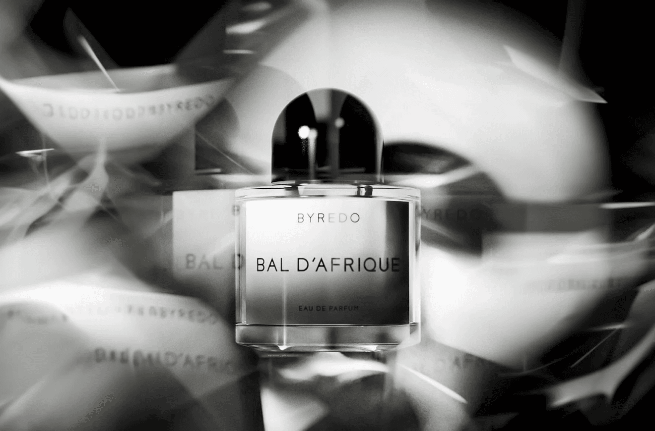
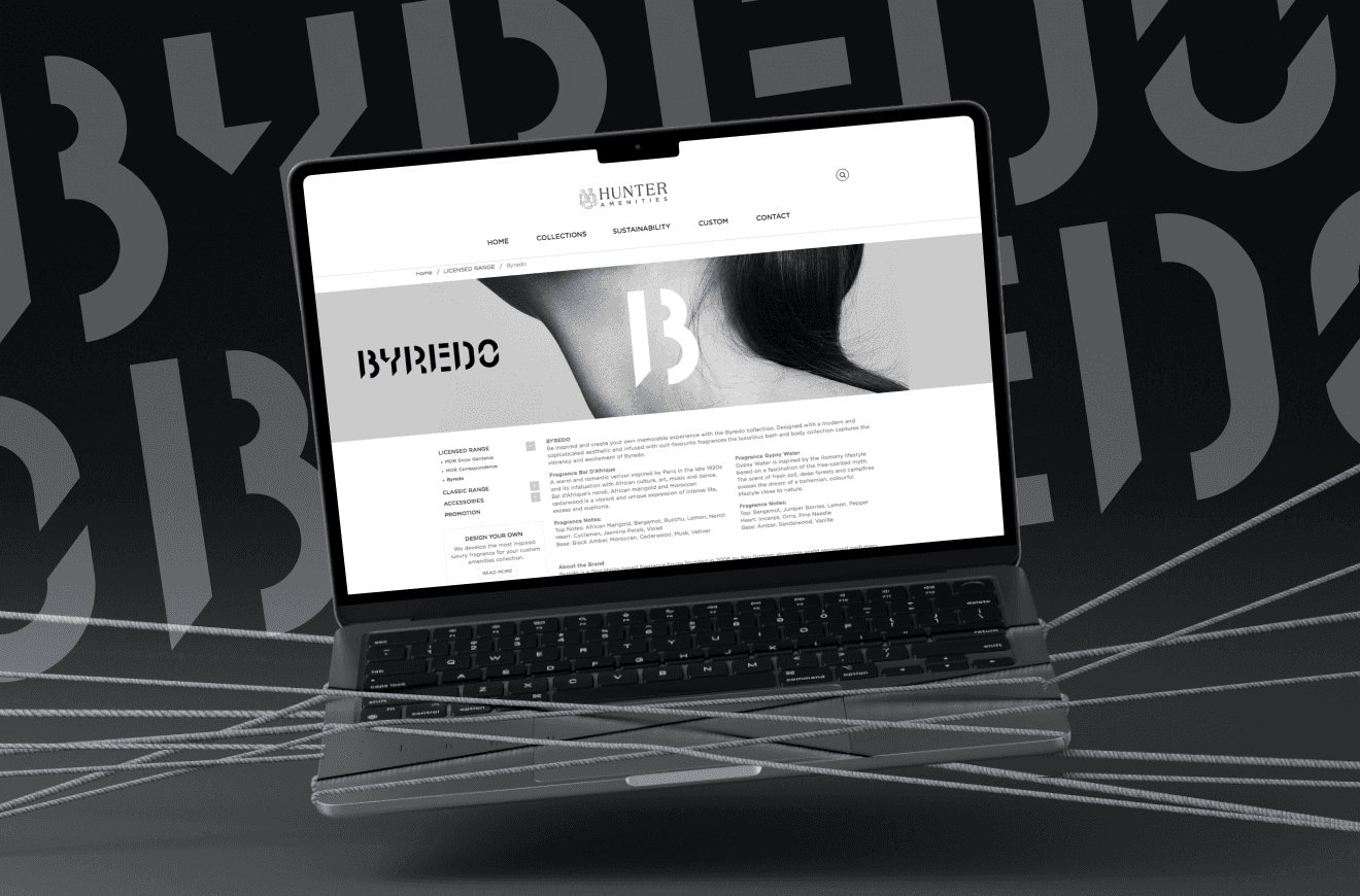
Byredo is a Stockholm-founded luxury fragrance and lifestyle house known for its restraint. Every product decision is made at the level of material, not decoration. The hotel amenity programme extended that philosophy into the hospitality context, where the consumer is not browsing or deciding, but trusting.
+ PROJECT OVERVIEW
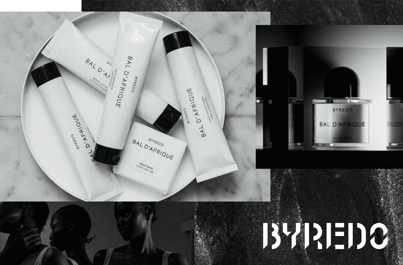
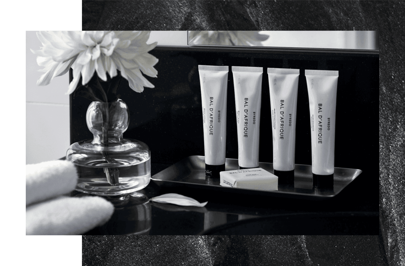
Art direction for the Byredo global hotel amenity programme, via Hunter Amenities. The brief wasn't about the bottle. It was about what a guest feels when they reach for it at 6am in an unfamiliar room, disoriented, trusting rather than deciding. Every material, finish and typographic decision followed from that moment. The matte finish was chosen not for aesthetics but for tactile and visual performance under fluorescent bathroom light. The type hierarchy was set for legibility at arm's length, without glasses. The cap weight was calibrated for a tired hand. Each decision was made in service of a designed emotional experience — not in service of the brief as written. That distinction is what luxury packaging requires.
+ WHAT WE DELIVERED
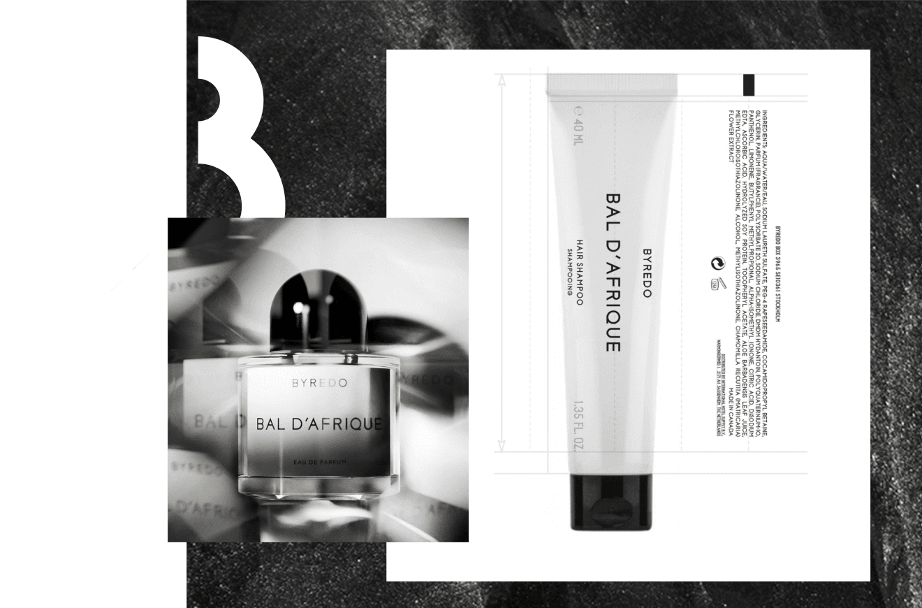
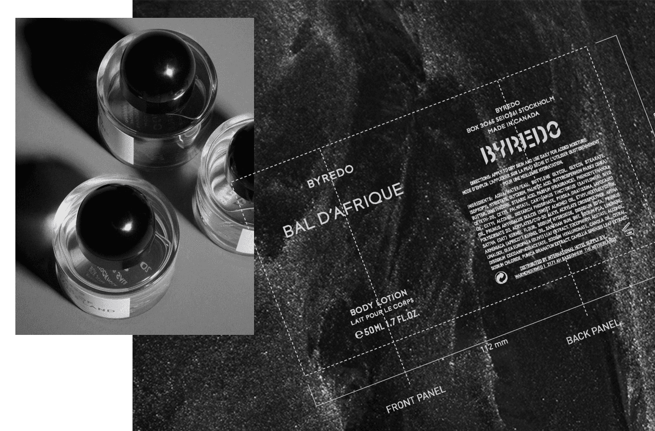
A complete hotel amenity suite; bottle, cap, tube, dispenser labelling and finish specifications for global rollout via Hunter Amenities. Art direction covered the full material and tactile system: finish selection, typographic hierarchy, cap weight calibration and production specification across all SKUs. The brief was interpreted through the Sensory Sequence, beginning not with how the product would look on a hotel shelf but with how it would feel in a guest's hand at the moment of first reach.
+ OUTCOME
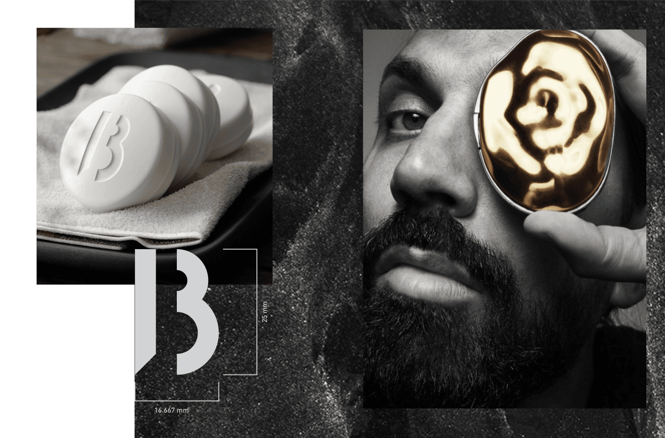
The programme was deployed across a global portfolio of luxury hotel properties, including InterContinental Barcelona, Sydney and Kuala Lumpur. Packaging designed for a moment of trust, rather than a moment of decision, requires a fundamentally different set of questions.
+ MY DELIVERABLES
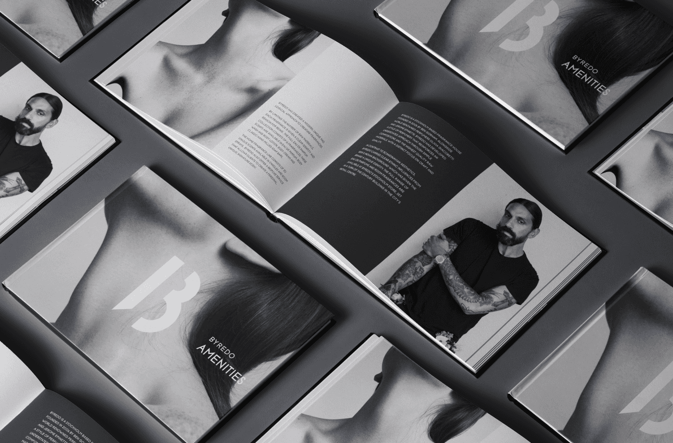
Art direction across the full collection, from concept through global production. Master artworks and structural packaging specifications, with regulatory compliance managed across EU, EMEA, UAE, APAC, Canada and America. Brand implementation guides built so the programme could deploy with the same integrity in every property, without me in the room.
NAVIGATION
SELECTED WORK
© 2025 Shelley Stellenberg. All rights reserved.
We are proud to acknowledge the Wurundjeri Woi Wurrung people of the Eastern Kulin Nation as the traditional custodians of the land on which we work. We pay respect to their Elders past and present.
NAVIGATION
SELECTED WORK
© 2025 Shelley Stellenberg. All rights reserved.
We are proud to acknowledge the Wurundjeri Woi Wurrung people of the Eastern Kulin Nation as the traditional custodians of the land on which we work. We pay respect to their Elders past and present.
NAVIGATION
SELECTED WORK
© 2025 Shelley Stellenberg. All rights reserved.
We are proud to acknowledge the Wurundjeri Woi Wurrung people of the Eastern Kulin Nation as the traditional custodians of the land on which we work. We pay respect to their Elders past and present.
Client
Client
Byredo
Byredo
Byredo is a Stockholm-founded luxury fragrance and lifestyle house known for its restraint. Every product decision is made at the level of material, not decoration. The hotel amenity programme extended that philosophy into the hospitality context, where the consumer is not browsing or deciding, but trusting.
+ PROJECT OVERVIEW
Art direction for the Byredo global hotel amenity programme, via Hunter Amenities. The brief wasn't about the bottle. It was about what a guest feels when they reach for it at 6am in an unfamiliar room, disoriented, trusting rather than deciding. Every material, finish and typographic decision followed from that moment. The matte finish was chosen not for aesthetics but for tactile and visual performance under fluorescent bathroom light. The type hierarchy was set for legibility at arm's length, without glasses. The cap weight was calibrated for a tired hand. Each decision was made in service of a designed emotional experience — not in service of the brief as written. That distinction is what luxury packaging requires.
+ WHAT WE DELIVERED
A complete hotel amenity suite; bottle, cap, tube, dispenser labelling and finish specifications for global rollout via Hunter Amenities. Art direction covered the full material and tactile system: finish selection, typographic hierarchy, cap weight calibration and production specification across all SKUs. The brief was interpreted through the Sensory Sequence, beginning not with how the product would look on a hotel shelf but with how it would feel in a guest's hand at the moment of first reach.
+ OUTCOME
The programme was deployed across a global portfolio of luxury hotel properties, including InterContinental Barcelona, Sydney and Kuala Lumpur. Packaging designed for a moment of trust, rather than a moment of decision, requires a fundamentally different set of questions.
+ MY DELIVERABLES
Art direction across the full collection, from concept through global production. Master artworks and structural packaging specifications, with regulatory compliance managed across EU, EMEA, UAE, APAC, Canada and America. Brand implementation guides built so the programme could deploy with the same integrity in every property, without me in the room.
Client
Client
Byredo
Byredo
Byredo is a Stockholm-founded luxury fragrance and lifestyle house known for its restraint. Every product decision is made at the level of material, not decoration. The hotel amenity programme extended that philosophy into the hospitality context, where the consumer is not browsing or deciding, but trusting.
+ PROJECT OVERVIEW
Art direction for the Byredo global hotel amenity programme, via Hunter Amenities. The brief wasn't about the bottle. It was about what a guest feels when they reach for it at 6am in an unfamiliar room, disoriented, trusting rather than deciding. Every material, finish and typographic decision followed from that moment. The matte finish was chosen not for aesthetics but for tactile and visual performance under fluorescent bathroom light. The type hierarchy was set for legibility at arm's length, without glasses. The cap weight was calibrated for a tired hand. Each decision was made in service of a designed emotional experience — not in service of the brief as written. That distinction is what luxury packaging requires.
+ WHAT WE DELIVERED
A complete hotel amenity suite; bottle, cap, tube, dispenser labelling and finish specifications for global rollout via Hunter Amenities. Art direction covered the full material and tactile system: finish selection, typographic hierarchy, cap weight calibration and production specification across all SKUs. The brief was interpreted through the Sensory Sequence, beginning not with how the product would look on a hotel shelf but with how it would feel in a guest's hand at the moment of first reach.
+ OUTCOME
The programme was deployed across a global portfolio of luxury hotel properties, including InterContinental Barcelona, Sydney and Kuala Lumpur. Packaging designed for a moment of trust, rather than a moment of decision, requires a fundamentally different set of questions.
+ MY DELIVERABLES
Art direction across the full collection, from concept through global production. Master artworks and structural packaging specifications, with regulatory compliance managed across EU, EMEA, UAE, APAC, Canada and America. Brand implementation guides built so the programme could deploy with the same integrity in every property, without me in the room.