Client
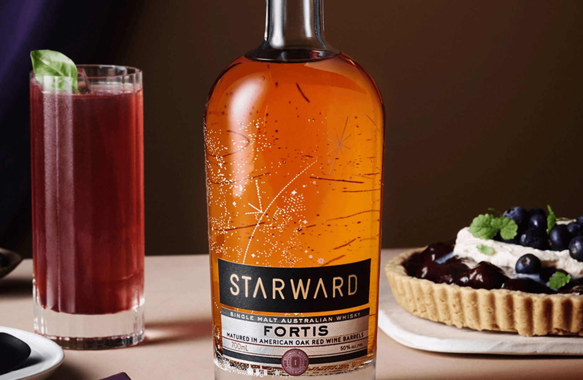
Starward Whisky Fortis
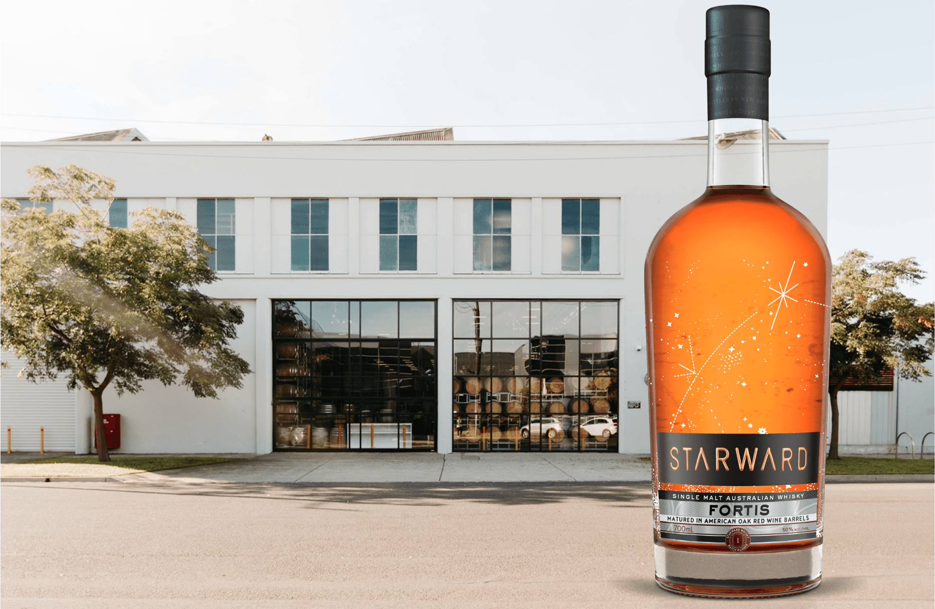
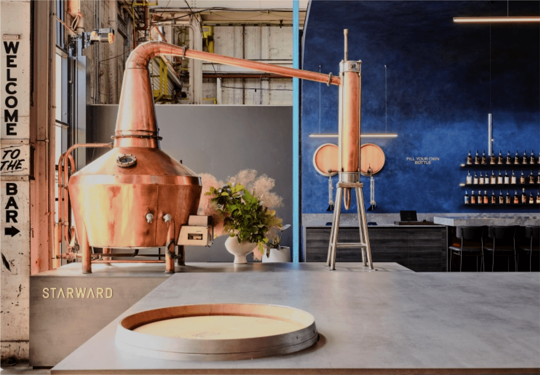
Starward Whisky was founded in Melbourne and represents Australian innovation in craft spirits. The brand has achieved international acclaim, winning the Most Awarded International Distillery at the San Francisco World Spirits Competition twice in three years. Their dedication to using local ingredients and Australian red wine barrels has established them as a global leader in innovative whisky-making, producing a single malt character that is entirely its own. Starward earns its premium positioning through character rather than heritage. The Fortis expression is the brand's most ambitious release: bolder, more complex, and requiring packaging that communicated that confidence without borrowing the visual language of its international counterparts.
+ PROJECT OVERVIEW
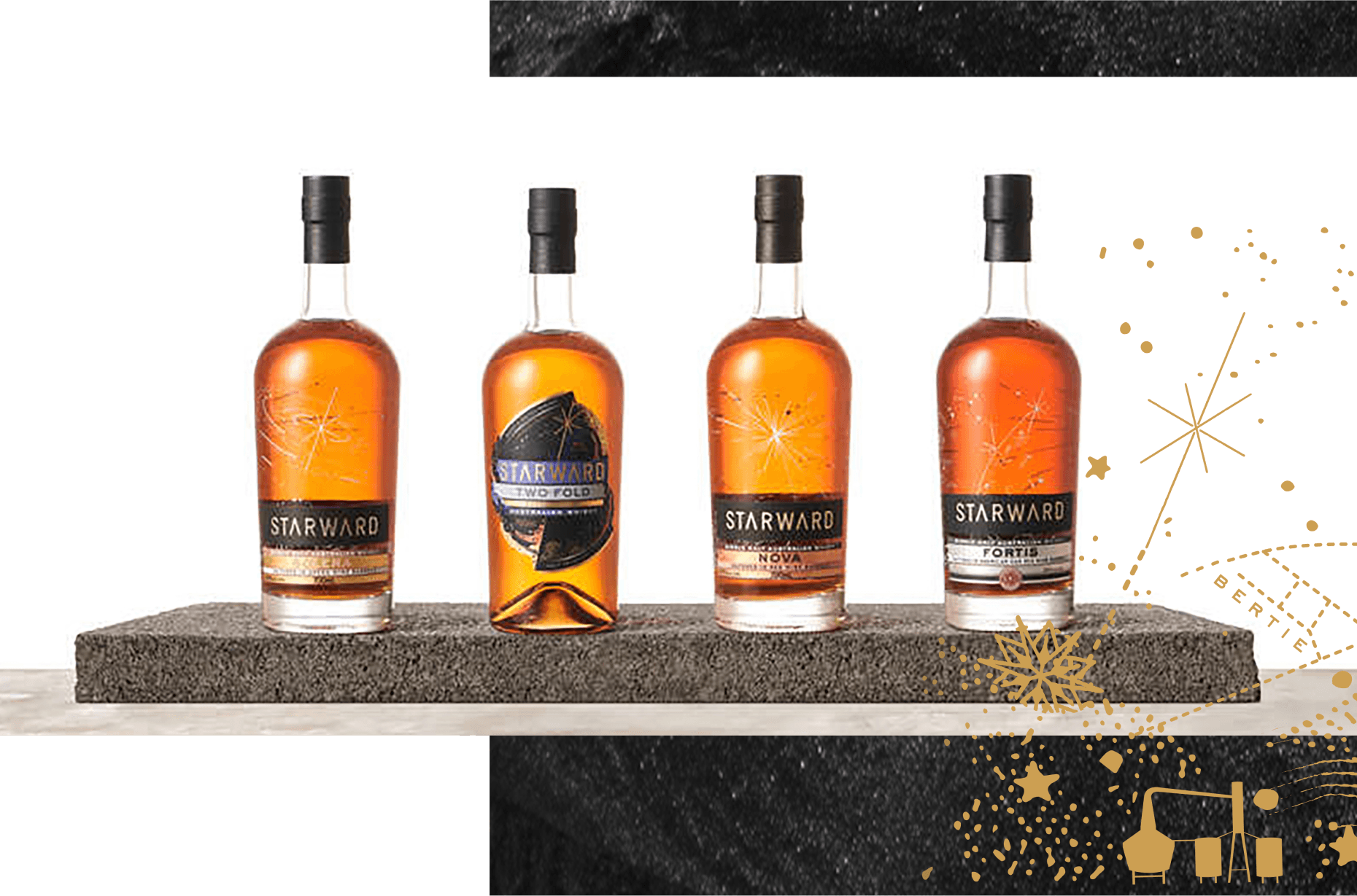
Led the development of new label concepts for Starward's core whisky collection, focusing on complementing the existing Nova and Two-Fold bottles while creating clear visual differentiation for the Fortis expression. The brief required a label that positioned Fortis above the standard range while maintaining visual continuity with the brand family.
The challenge was earning premium authority in a category where that signal is most commonly borrowed from tradition: aged distillery heritage, dark colour palettes, historical type. Starward has none of that heritage to borrow. The label had to earn its authority through design decisions alone. The micro-foiling technique applied to the Fortis label was, at the time of production, at the edge of what the print industry could achieve at this price point. Eleven physical proofs were developed before the specification was finalised.
+ WHAT WE DELIVERED
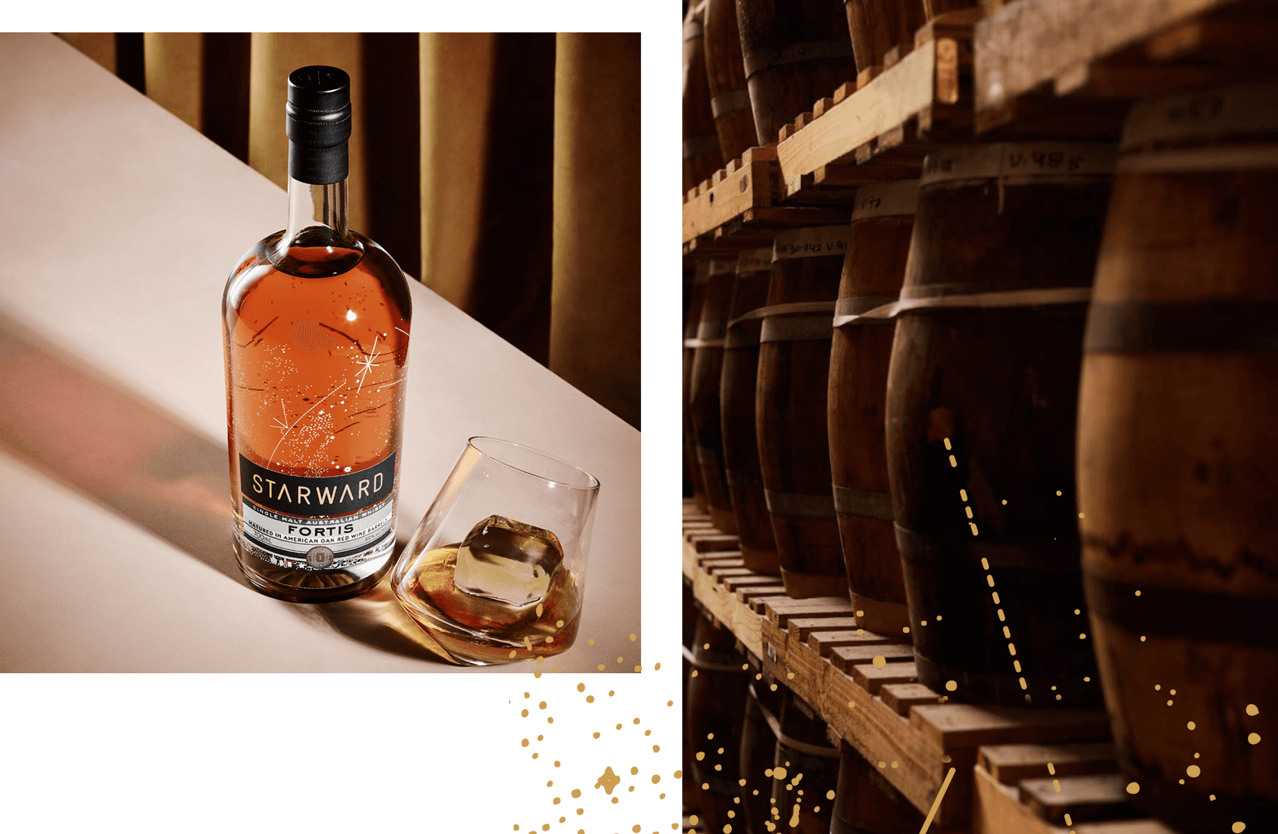
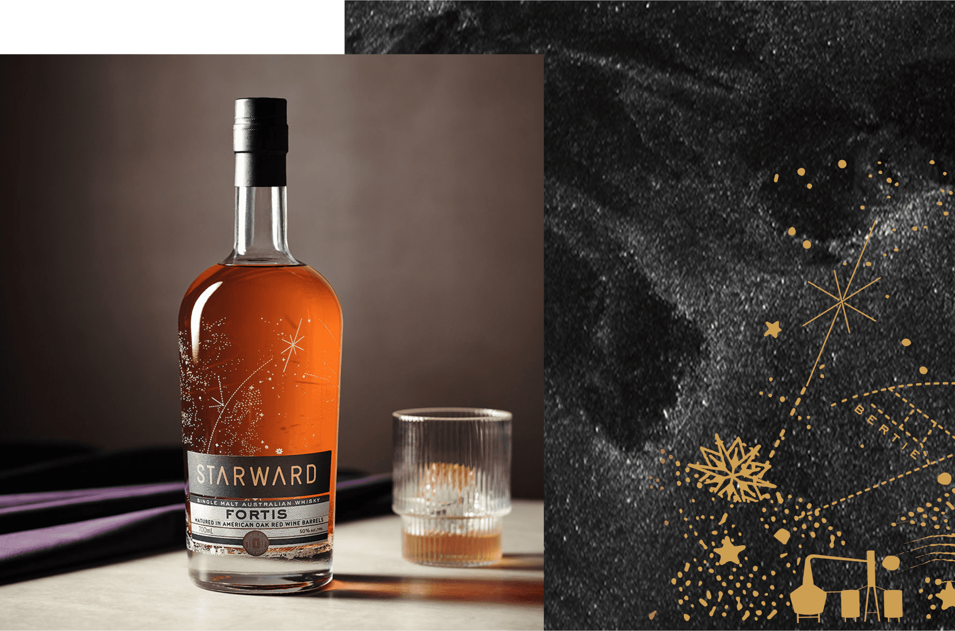
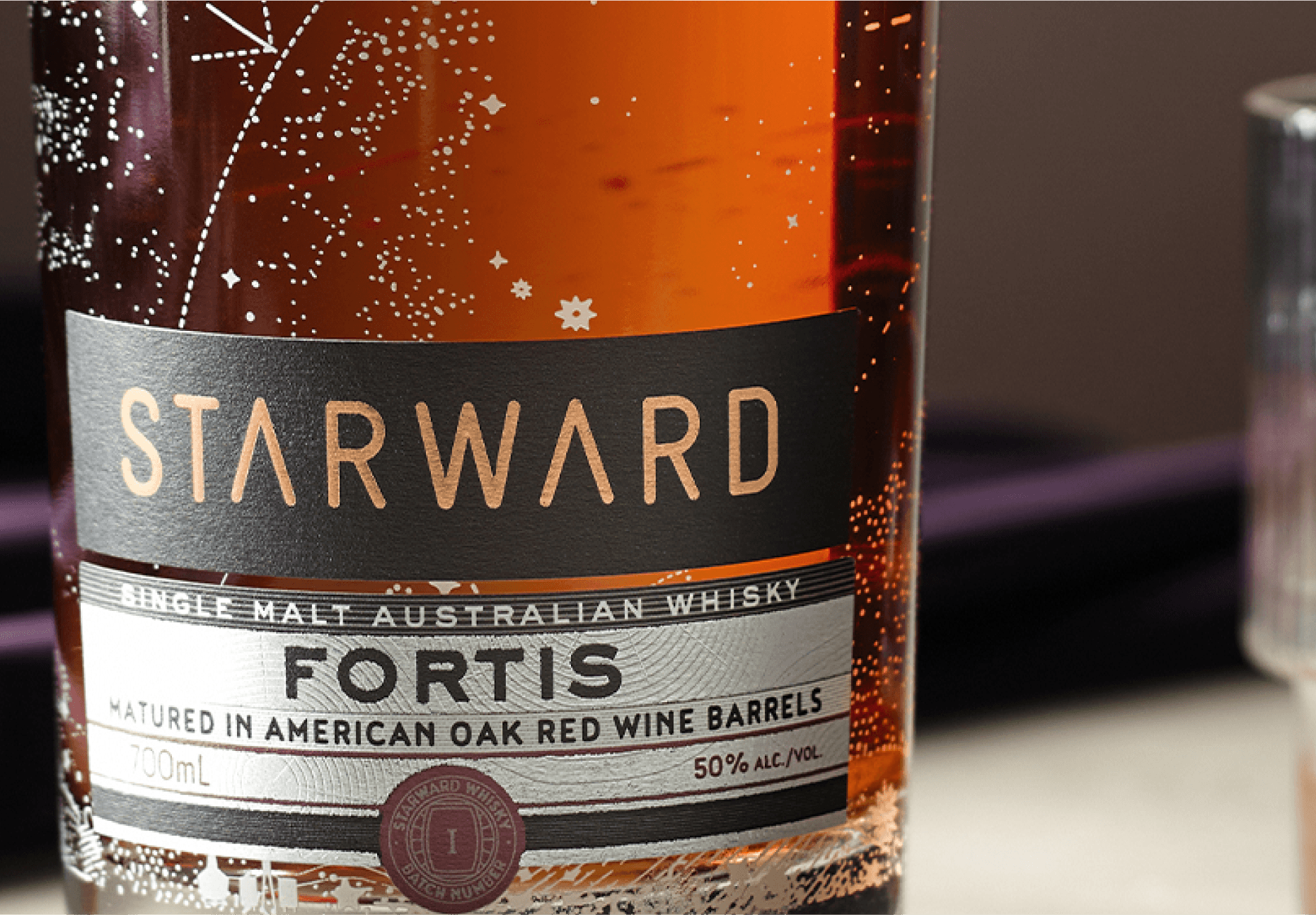
Created a bespoke label design incorporating unique batch numbering and embossed foil patterns inspired by white American oak barrels. Led the development of distinct colour palettes and typography that maintained brand cohesion while establishing a unique identity for Fortis within the range.
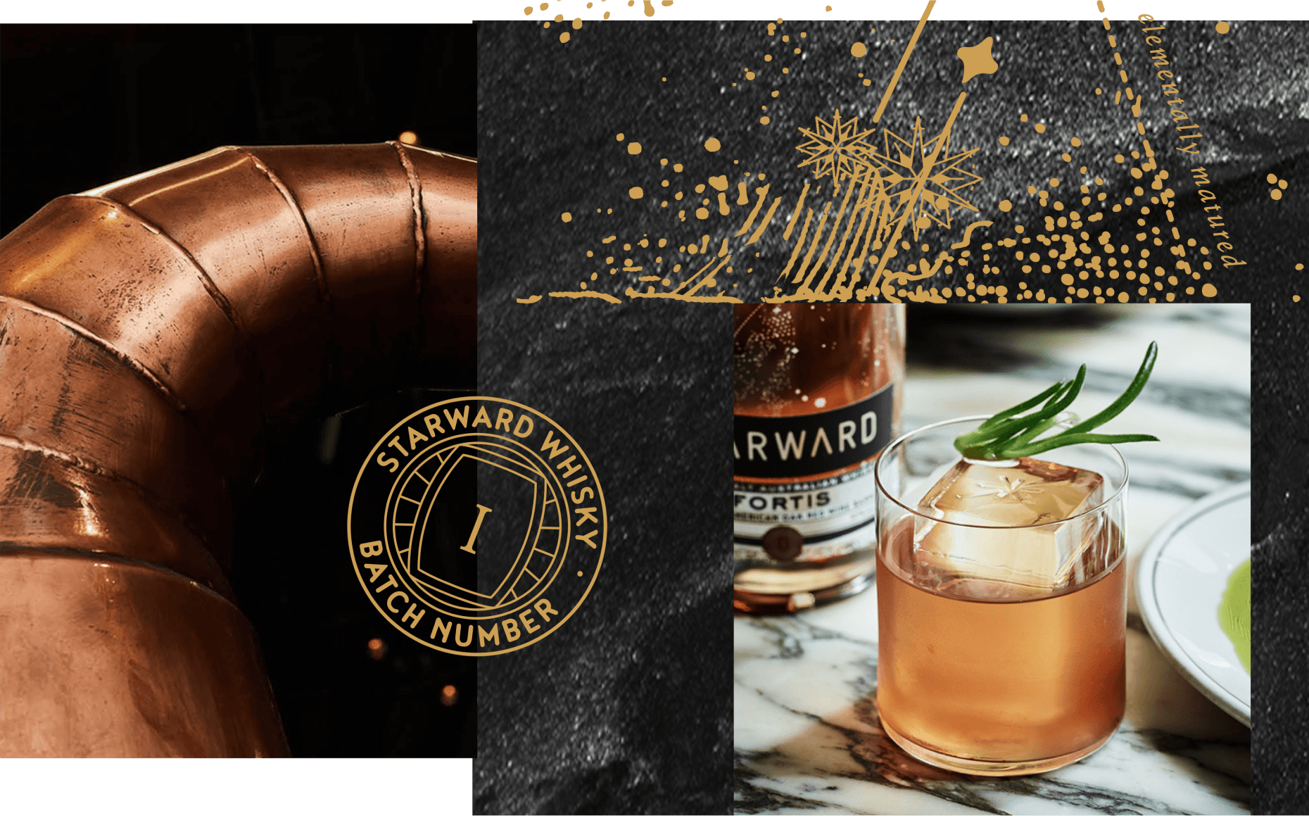
The micro-foiling was used not for decoration but to express the quiet confidence of a whisky that earns its character through time. The metallic finish catches light at the specific moments that matter, rather than demanding attention continuously. Directed production of comprehensive marketing materials across digital and print channels to support the launch of this award-winning expression.
+ OUTCOME
Successfully launched Starward Fortis across Australian and international markets with a distinctive story-led label design. Fortis went on to win multiple international awards, including Bronze at the World Whiskies Awards 2021 and Silver at the World Whiskies Awards 2022. The design established clear differentiation within the core range while maintaining collection cohesiveness, supporting Starward's achievement of 29 medals at the San Francisco World Spirit Competition and their recognition as Whisky Company of the Year. Eleven proofs. One correct answer.
+ MY DELIVERABLES
Spearheaded the end-to-end design lifecycle from initial concept development to final prepress and production. Orchestrated partnerships with specialty print houses to achieve complex finishing techniques including micro-embossing, sculptured foiling and tactile varnishes. Managed colour calibration across substrates while implementing strict quality control measures for specialty print processes. Established detailed die-line specifications and structural engineering requirements while creating production guidelines. Supervised artwork adaptation for international markets, ensuring compliance with regional regulations while preserving design integrity.
NAVIGATION
SELECTED WORK
© 2025 Shelley Stellenberg. All rights reserved.
We are proud to acknowledge the Wurundjeri Woi Wurrung people of the Eastern Kulin Nation as the traditional custodians of the land on which we work. We pay respect to their Elders past and present.
NAVIGATION
SELECTED WORK
© 2025 Shelley Stellenberg. All rights reserved.
We are proud to acknowledge the Wurundjeri Woi Wurrung people of the Eastern Kulin Nation as the traditional custodians of the land on which we work. We pay respect to their Elders past and present.
NAVIGATION
SELECTED WORK
© 2025 Shelley Stellenberg. All rights reserved.
We are proud to acknowledge the Wurundjeri Woi Wurrung people of the Eastern Kulin Nation as the traditional custodians of the land on which we work. We pay respect to their Elders past and present.
Client
Client
Starward Whisky Fortis
Starward Whisky Fortis
Starward Whisky was founded in Melbourne and represents Australian innovation in craft spirits. The brand has achieved international acclaim, winning the Most Awarded International Distillery at the San Francisco World Spirits Competition twice in three years. Their dedication to using local ingredients and Australian red wine barrels has established them as a global leader in innovative whisky-making, producing a single malt character that is entirely its own. Starward earns its premium positioning through character rather than heritage. The Fortis expression is the brand's most ambitious release: bolder, more complex, and requiring packaging that communicated that confidence without borrowing the visual language of its international counterparts.
+ PROJECT OVERVIEW
Led the development of new label concepts for Starward's core whisky collection, focusing on complementing the existing Nova and Two-Fold bottles while creating clear visual differentiation for the Fortis expression. The brief required a label that positioned Fortis above the standard range while maintaining visual continuity with the brand family.
The challenge was earning premium authority in a category where that signal is most commonly borrowed from tradition: aged distillery heritage, dark colour palettes, historical type. Starward has none of that heritage to borrow. The label had to earn its authority through design decisions alone. The micro-foiling technique applied to the Fortis label was, at the time of production, at the edge of what the print industry could achieve at this price point. Eleven physical proofs were developed before the specification was finalised.
+ WHAT WE DELIVERED
Created a bespoke label design incorporating unique batch numbering and embossed foil patterns inspired by white American oak barrels. Led the development of distinct colour palettes and typography that maintained brand cohesion while establishing a unique identity for Fortis within the range.
The micro-foiling was used not for decoration but to express the quiet confidence of a whisky that earns its character through time. The metallic finish catches light at the specific moments that matter, rather than demanding attention continuously. Directed production of comprehensive marketing materials across digital and print channels to support the launch of this award-winning expression.
+ OUTCOME
Successfully launched Starward Fortis across Australian and international markets with a distinctive story-led label design. Fortis went on to win multiple international awards, including Bronze at the World Whiskies Awards 2021 and Silver at the World Whiskies Awards 2022. The design established clear differentiation within the core range while maintaining collection cohesiveness, supporting Starward's achievement of 29 medals at the San Francisco World Spirit Competition and their recognition as Whisky Company of the Year. Eleven proofs. One correct answer.
+ MY DELIVERABLES
Spearheaded the end-to-end design lifecycle from initial concept development to final prepress and production. Orchestrated partnerships with specialty print houses to achieve complex finishing techniques including micro-embossing, sculptured foiling and tactile varnishes. Managed colour calibration across substrates while implementing strict quality control measures for specialty print processes. Established detailed die-line specifications and structural engineering requirements while creating production guidelines. Supervised artwork adaptation for international markets, ensuring compliance with regional regulations while preserving design integrity.
Client
Client
Starward Whisky Fortis
Starward Whisky Fortis
Starward Whisky was founded in Melbourne and represents Australian innovation in craft spirits. The brand has achieved international acclaim, winning the Most Awarded International Distillery at the San Francisco World Spirits Competition twice in three years. Their dedication to using local ingredients and Australian red wine barrels has established them as a global leader in innovative whisky-making, producing a single malt character that is entirely its own. Starward earns its premium positioning through character rather than heritage. The Fortis expression is the brand's most ambitious release: bolder, more complex, and requiring packaging that communicated that confidence without borrowing the visual language of its international counterparts.
+ PROJECT OVERVIEW
Led the development of new label concepts for Starward's core whisky collection, focusing on complementing the existing Nova and Two-Fold bottles while creating clear visual differentiation for the Fortis expression. The brief required a label that positioned Fortis above the standard range while maintaining visual continuity with the brand family.
The challenge was earning premium authority in a category where that signal is most commonly borrowed from tradition: aged distillery heritage, dark colour palettes, historical type. Starward has none of that heritage to borrow. The label had to earn its authority through design decisions alone. The micro-foiling technique applied to the Fortis label was, at the time of production, at the edge of what the print industry could achieve at this price point. Eleven physical proofs were developed before the specification was finalised.
+ WHAT WE DELIVERED
Created a bespoke label design incorporating unique batch numbering and embossed foil patterns inspired by white American oak barrels. Led the development of distinct colour palettes and typography that maintained brand cohesion while establishing a unique identity for Fortis within the range.
The micro-foiling was used not for decoration but to express the quiet confidence of a whisky that earns its character through time. The metallic finish catches light at the specific moments that matter, rather than demanding attention continuously. Directed production of comprehensive marketing materials across digital and print channels to support the launch of this award-winning expression.
+ OUTCOME
Successfully launched Starward Fortis across Australian and international markets with a distinctive story-led label design. Fortis went on to win multiple international awards, including Bronze at the World Whiskies Awards 2021 and Silver at the World Whiskies Awards 2022. The design established clear differentiation within the core range while maintaining collection cohesiveness, supporting Starward's achievement of 29 medals at the San Francisco World Spirit Competition and their recognition as Whisky Company of the Year. Eleven proofs. One correct answer.
+ MY DELIVERABLES
Spearheaded the end-to-end design lifecycle from initial concept development to final prepress and production. Orchestrated partnerships with specialty print houses to achieve complex finishing techniques including micro-embossing, sculptured foiling and tactile varnishes. Managed colour calibration across substrates while implementing strict quality control measures for specialty print processes. Established detailed die-line specifications and structural engineering requirements while creating production guidelines. Supervised artwork adaptation for international markets, ensuring compliance with regional regulations while preserving design integrity.